When it comes to food, we don’t just eat with our mouths — we eat with our eyes first. Long before we take a bite, our brains have already made assumptions about flavor, freshness, and satisfaction, simply based on what we see. One of the most powerful visual cues? Color.
Welcome to the fascinating world of color psychology in food presentation, where chefs, marketers, and even neuroscientists agree — the right color can make food look more appealing, tastier, and even healthier.
🍓 The Emotional Power of Color
Colors affect our emotions. That’s a fact widely used in advertising, fashion, and interior design. In food, colors can do even more — they can shape how we experience taste.
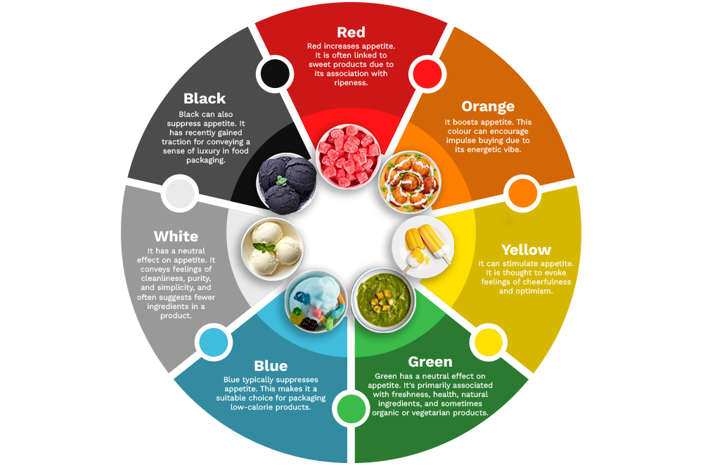
Here’s how common food colors influence perception:
- Red & Yellow: Often used by fast-food chains, these colors stimulate appetite and evoke feelings of excitement and warmth. Red is even believed to increase heart rate!
- Green: Associated with freshness, health, and nature. A salad with multiple shades of green looks more vibrant — and healthier.
- Blue: Surprisingly, blue is a natural appetite suppressant. That’s because it’s rare in natural food, so our brains associate it with something unnatural or even spoiled.
- White: Clean and minimalist, but too much white can make a dish look bland unless paired with contrasting elements.
- Black: Chic and modern. Used in moderation, it adds sophistication — think black plates that contrast with colorful food.
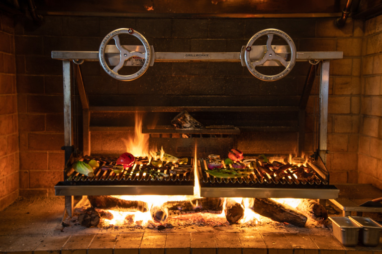
🍽️ How Chefs Use Color to Their Advantage
Professional chefs and food stylists use color to:
- Balance the plate: A dish that’s all brown or beige (like steak and potatoes) can look heavy or dull. Adding a pop of green (herbs, microgreens) or red (chili, tomato) livens it up instantly.
- Highlight freshness: Bright vegetables and fruits in various colors not only look attractive but suggest that the dish is packed with vitamins.
- Create contrast: A white dessert on a dark plate, or a multicolored dish arranged in a specific pattern, draws the eye and creates a sense of order and artistry.
🧠 The Brain-Taste Connection
Interestingly, colors don’t just affect what we see — they influence what we taste:
- Orange or red drinks are perceived as sweeter, even when the sugar content is the same as a clear drink.
- Pink desserts are expected to taste like strawberry or raspberry, even if the flavor is different.
- Green smoothies are often assumed to be healthier (even if the ingredients are similar to a brown or purple version).
This psychological trick is often used in packaging and food photography. Ever noticed how a cereal box features extra vibrant fruit pieces?
🏡 Tips for Home Cooks & Food Creators
Want to apply this at home or in your food business? Try these tips:
- Use color contrast: Add a garnish or sauce in a contrasting color to make your dish pop.
- Play with plating: Dark plates can make light foods stand out, while white plates give a clean canvas for colorful dishes.
- Include fresh elements: Herbs, seeds, edible flowers, and seasonal produce all add visual appeal and hint at quality.
- Think seasonal: Warm tones in autumn, bright colors in summer — align your plate with the natural color palette of the season.
🍴 Conclusion
Food presentation isn’t just about beauty — it’s about storytelling, psychology, and experience. The colors you choose can entice, excite, and even influence how delicious your food feels.
So next time you prepare a meal, ask yourself: what is the color telling the brain before the tongue even gets involved?